

Mobile and cellular companies are notoriously due for improvement, and it was through Verizon that I applied my studies in user experience and content to a glaring bottleneck.
Project Overview
- Role: Content Designer, UX Designer Neil
- Timeline 5 days
The project began with a real problem that faced the consumer website for verizon.com and its mobile plans page. At the time of this study, the problem still faces the company.
Problem
The mobile plans page of verizon.com, a critical entry point for their service sales funnel, has a distracting user experience that lacks engagement, something corroborated by higher traffic rates to near peer competitors. Monthly page view and visit count among competitors (ATT, T-Mobile) are significantly higher as well, suggesting that engagement and retention could be increased through redesign.
Scope
Improve content and interaction on the mobile plans page (https://www.verizon.com/plans/unlimited) to increase engagement and retention.
Solution and Approach
To remedy the issues with the page, two methods were employed; content design and a user-centric design approach. UX would look into flow, color, typography, and interface, and content design would look into adjusting content to match known business requirements with greater user accessibility.
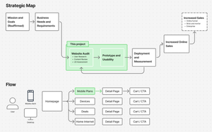
Discovery & Research Phase
Research Findings
- 32.7% of traffic to Verizon is from the desktop1
- Peer competitor ATT has 25% more web traffic
- Users are more likely to be older, near metros, and use their mobile devices for video content2
- High growth areas do not include California metros2
- Other users span domestic groups, in wide demographics
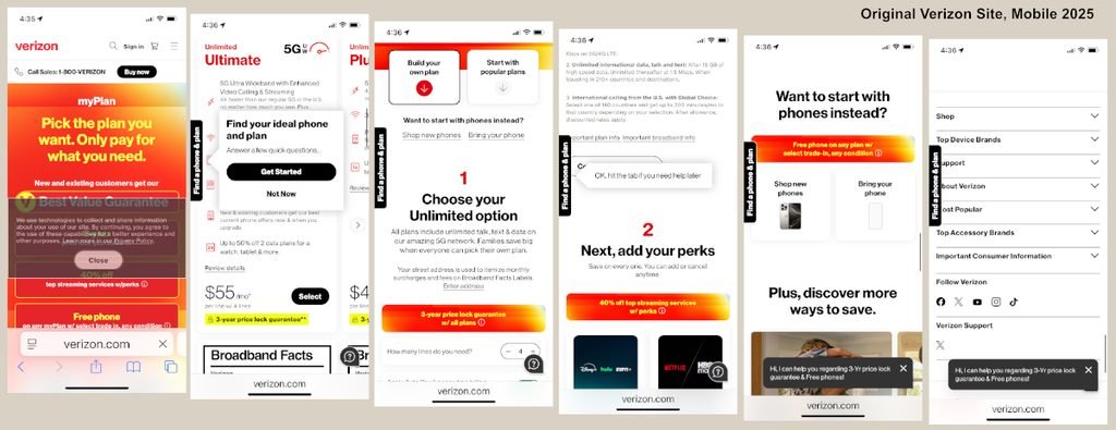
Identified Pain Points
- “Shopping for mobile plans takes too much time. There’s too much to go through.”
- “Mobile companies are always trying to trick you into paying more.”
- “There are too many hidden costs.”
- “All the plans look the same; what’s the difference?”
- “The amount of text is overwhelming.”
- “Feels like I have to hunt through the hype.”
User Needs:
- Have an option to purchase a phone
- Find a well-priced phone plan
- Understand what the plan entails
- Feel confidence in company and process
Ideation and Design
As I brainstormed about changes and revisions, I thought about three principles that I wanted to apply:
Transparent.
- Describe in clear terms what costs are, where to save, or what benefits are
User-centric.
- Users are busy people who need simplicity and can make their own decisions. Content should presume intelligence rather than frustration, with the voice and tone being helpful and empowering.
Trustworthy.
- Pages and content stays consistent through pages, explain changes
Design Notes
As I began to lay out possible changes and iterate on how to establish trust with users, a few other ideas came out. One was that in addition to being sensitive to users, I should take into account previous designs and not go too far away from current iterations. Design changes between pages may lead to distrust (lack of continuity), and the scope of the project should be respected as well. Time, money, testing, and probably some legal teams had gone into the current site, after all.
Second was that users would want to save time, and that the top of the screen – that first view on any device – was critical for first impressions. The hero and the card style would likely have to be truncated or altered, accordingly. In hand drawn sketches and wireframes I would need to find ways to get back that real estate while keeping the flow of the site.
Third was that simplifying content wherever possible was essential. The more I could reduce the cognitive load, the more the user could focus on their choices, and the easier the process would be for users facing language, physical, or cultural barriers.
I would go on to develop three alternates to the page in Figma, each designed to appeal to different priorities Verizon might have.
Version 1, Minimal Change
In Version 1 the overall structure and layout were maintained while changes were made to navigation, color, content, and some container shapes. Version 1 responds to quick fixes with minimal impact on budgets with the highest amount of site continuity. Details are available in the full case study.
Version 2, Streamlined Change
Version 2 is designed to reduce time-to-action, and requires some restructuring. Overall flow is maintained and the plan selection process is streamlined. Original card layouts are modified to include previously separate functions, and collapsable cards allow for the greatest visibility for plan selection. It requires more detailed design work than Version 1. Details are available in the full case study.
Version 3, AI Generated Design
AI was used to create another alternative to the page(s), not only to explore AI design capabilities, but also to speed the solution set. Details are available in the full case study.
Which version won? What things were changed? Is there a customer journey too? All that and more are available in the full case study. Feel free to reach out and I will be happy to share more with you. Contact me at neil@_(this website)__.com
Leave a Reply