

Refining content and interface on a popular telecom site to increase engagement
Problem
A critical entry point for consumers shopping for mobile plans is clogged, distracting, and costing the company engagement.
The story begins…
Just as many customers, I found myself on the phone late at night, poking through sites there was no time for during the day. There was a new release of a mobile phone, and it got me wondering if an upgrade was in my future.
It occurred to me that maybe a deal with one of the telecom carriers could be a way to ease the cost, so I went to one. Then another. Then another, slumping deeper into the couch with each site. By the time I hit Verizon I wasn’t thinking about deals any more. I was thinking about UX, and thinking about what could be different.
Approaching the problem
From the first moments on the page I knew things were off, and that there were questions to answer.
Am I alone in this thinking? Is Verizon losing out on potential customers? If so, what are the pain points to address?
What would be the business requirements and constraints for making changes?
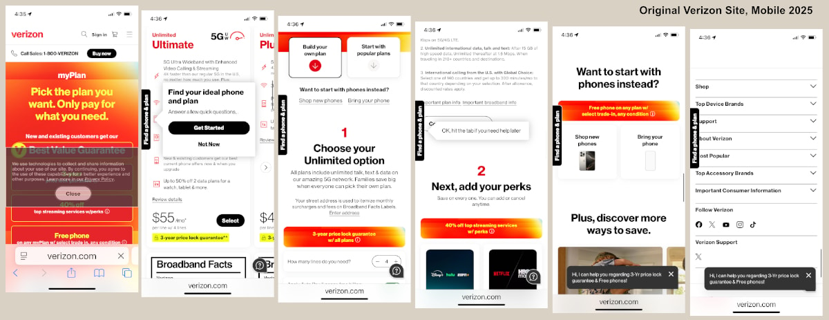
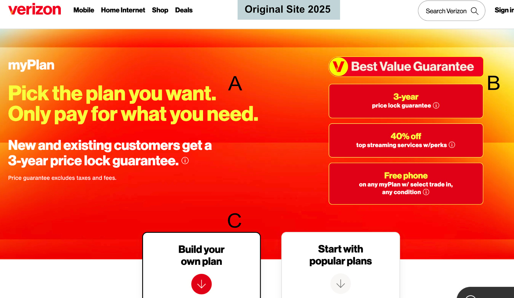
The original site required scrolling across page and had a heavy cognitive load
Research and Discovery
The first steps in the information gathering phase was to conduct a Competitive Analysis of key competitors (competitors able to use their own network, whose adoption numbers were comparable). Knowing more about how Verizon differentiated itself was useful and led to some potential opportunities. Each of the big 3 (Verizon, AT&T, T-Mobile) are mass market players, but interestingly also have niche markets. Monthly page view and visit count among competitors (ATT, T-Mobile) are significantly higher as well, suggesting that engagement and retention could be increased through redesign.
All of them share a similar online sales funnel, though in a closer examination of their websites, both AT&T and T-Mobile use an information-first approach to their pages. By giving price information and clear choices to guide users, they give the appearance of greater trust, which I would soon confirm from users.
Polling informally and using user forums I was able to discover some pain points customers have, many of which could be addressed through adjustments in UI, UX, and ultimately product offerings.
User Pain Points
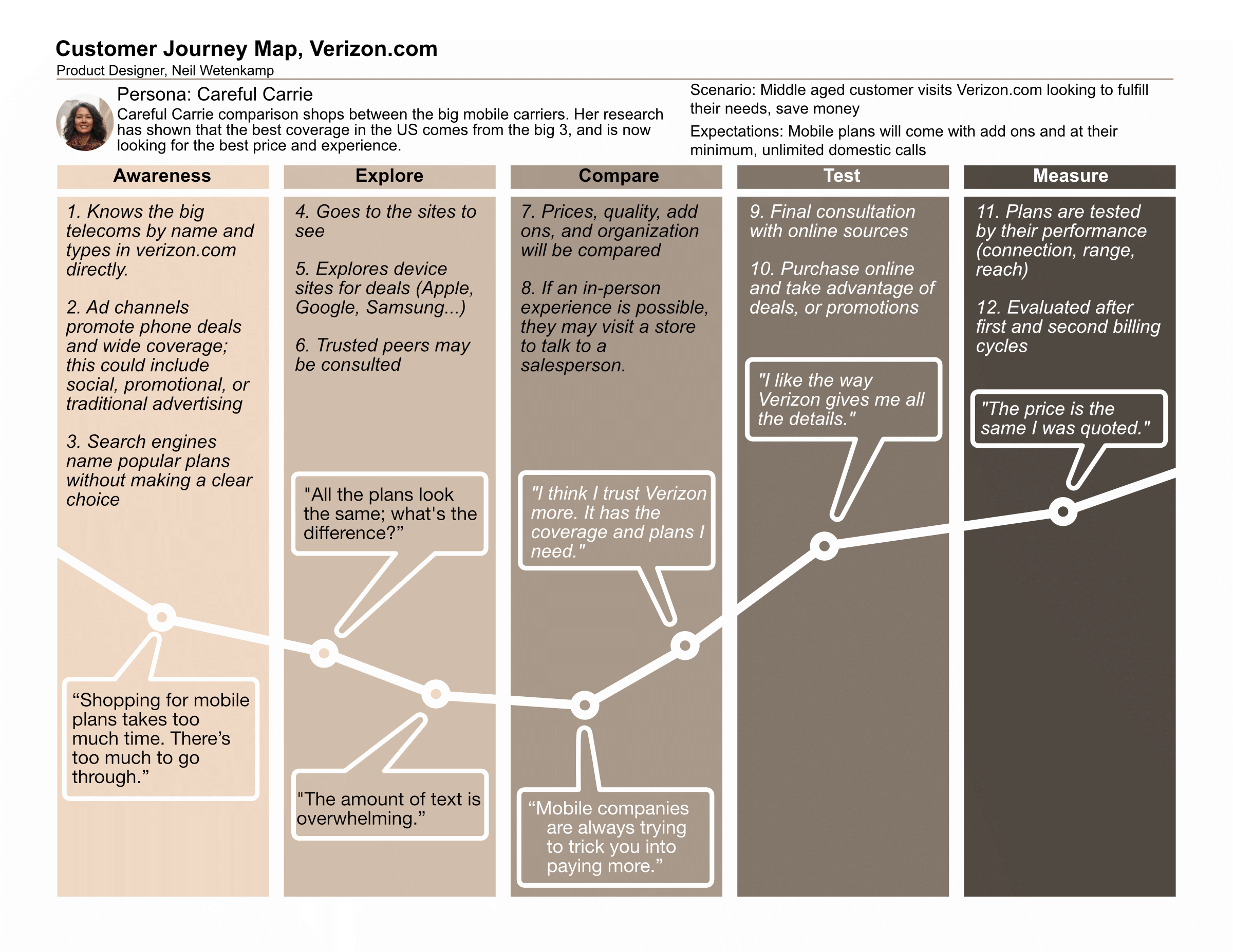
- “Shopping for mobile plans takes too much time. There’s too much to go through.”
- “Mobile companies are always trying to trick you into paying more.”
- “There are too many hidden costs.”
- “All the plans look the same; what’s the difference?”
- “The amount of text is overwhelming.”
- “Feels like I have to hunt through the hype.”
Looking at the user pain points, a customer journey was created to help visualize a path for success. It begins with known dissatisfaction with shopping, then shows how users could be won over at the comparison stage (where Verizon’s Unlimited Plans page is a major touchpoint), beginning their long term journey with the company. For Verizon the important touchpoints are in the exploration and comparison phases, and there are some interesting opportunities there. Outside the scope of this project, the company could utilize new marketing channels (grassroots/storefront/venues) with a feature add to promote new value, or to establish the company with identity marketing.
Business, Scope, and System Design
Armed with clear needs and a sense of what the users are facing, I went on to refine what the project would entail.
Business Requirements
Every business needs to see an ROI for its effort, and in this case, an obvious ROI for Verizon is increased engagement with its users. Measurable by traffic, time on site, heat maps, and click through rates, and conversions, the more time users spend on Verizon’s site, the better. Hence, requirement 1, changes to the site need to lead to an increase of sales. Requirement 2 is to follow brand guidelines and practices – don’t reinvent expensive wheels, in other words.
Scope
The mobile plans page of verizon.com, a critical entry point for their service sales funnel, has a distracting user experience that lacks engagement, and will be changed through this project. This project would limit content and user interface changes to a single page to show how changes could improve the “top of the funnel” for the site. Were the changes or ideas to be adopted, the scope would need to be widened to include the checkout process and conclusion (looping) for the site.
System Design
The limited scope of the project does not make an impact on the system design of the online sales funnel, yet I will provide an option for changes in the below Strategic Roadmap and flow chart.
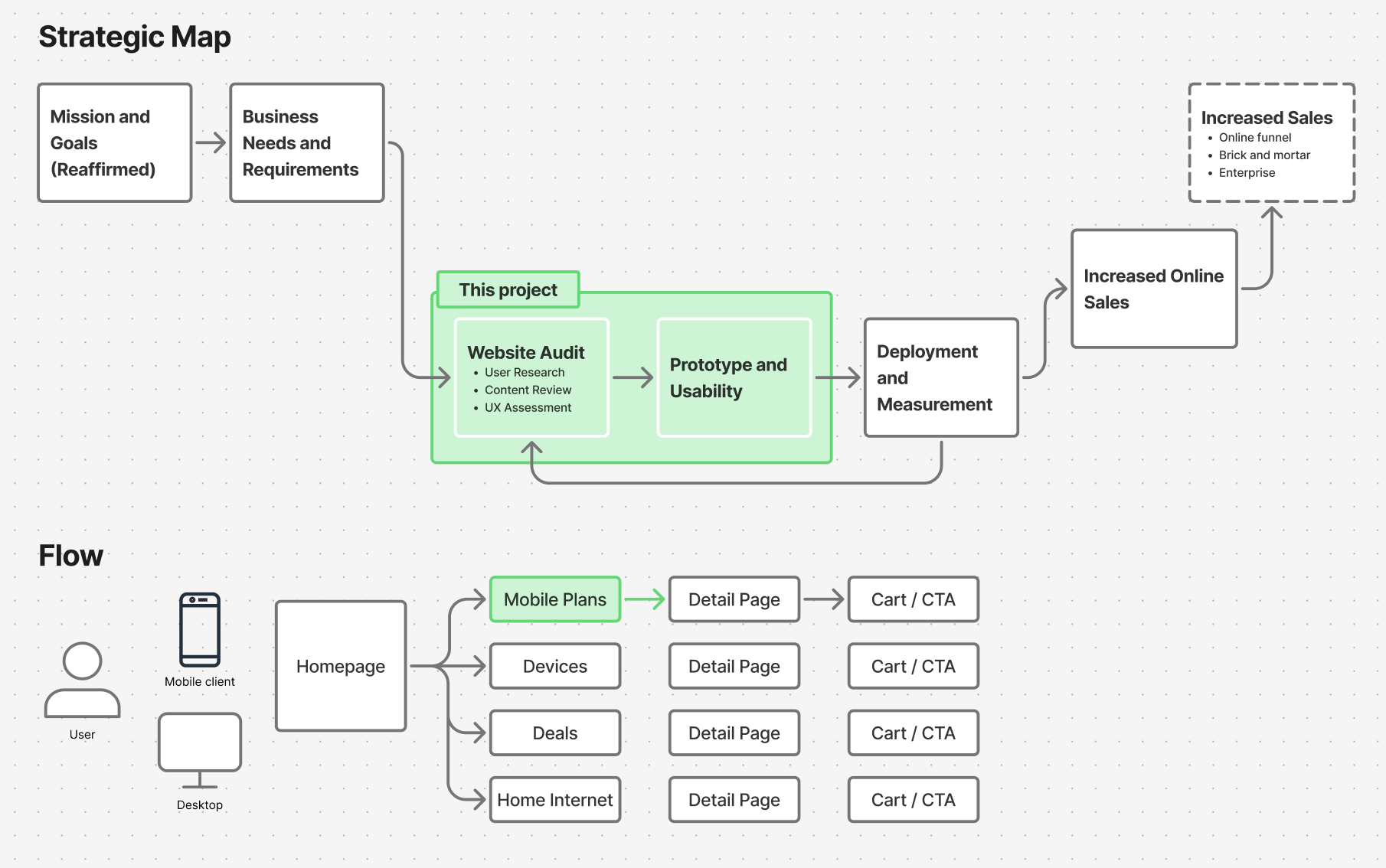
Strategic overview and flow
Ideation and Design
As I brainstormed about changes and revisions, I thought about three principles that I wanted to apply:
Transparent as possible.
Describe in clear terms what costs are, where to save, or what benefits are
User-centric.
Users are busy people who need simplicity and can make their own decisions. Content should presume intelligence rather than frustration, with the voice and tone being helpful and empowering.
Trustworthy.
Pages and content stays consistent through pages, explain changes
Design Notes
As I began to lay out possible changes and iterate on how to establish trust with users, a few other ideas came out. One was that in addition to being sensitive to users, I should take into account previous designs and not go too far away from current iterations. Design changes between pages may lead to distrust (lack of continuity), and the scope of the project should be respected as well. Time, money, testing, and probably some legal teams had gone into the current site, after all.
Second was that users would want to save time, and that the top of the screen – that first view on any device – was critical for first impressions. The hero and the card style would likely have to be truncated or altered, accordingly. In hand drawn sketches and wireframes I would need to find ways to get back that real estate while keeping the flow of the site.
Third was that simplifying content wherever possible was essential. The more I could reduce the cognitive load, the more the user could focus on their choices, and the easier the process would be for users facing language, physical, or cultural barriers.
Content Design
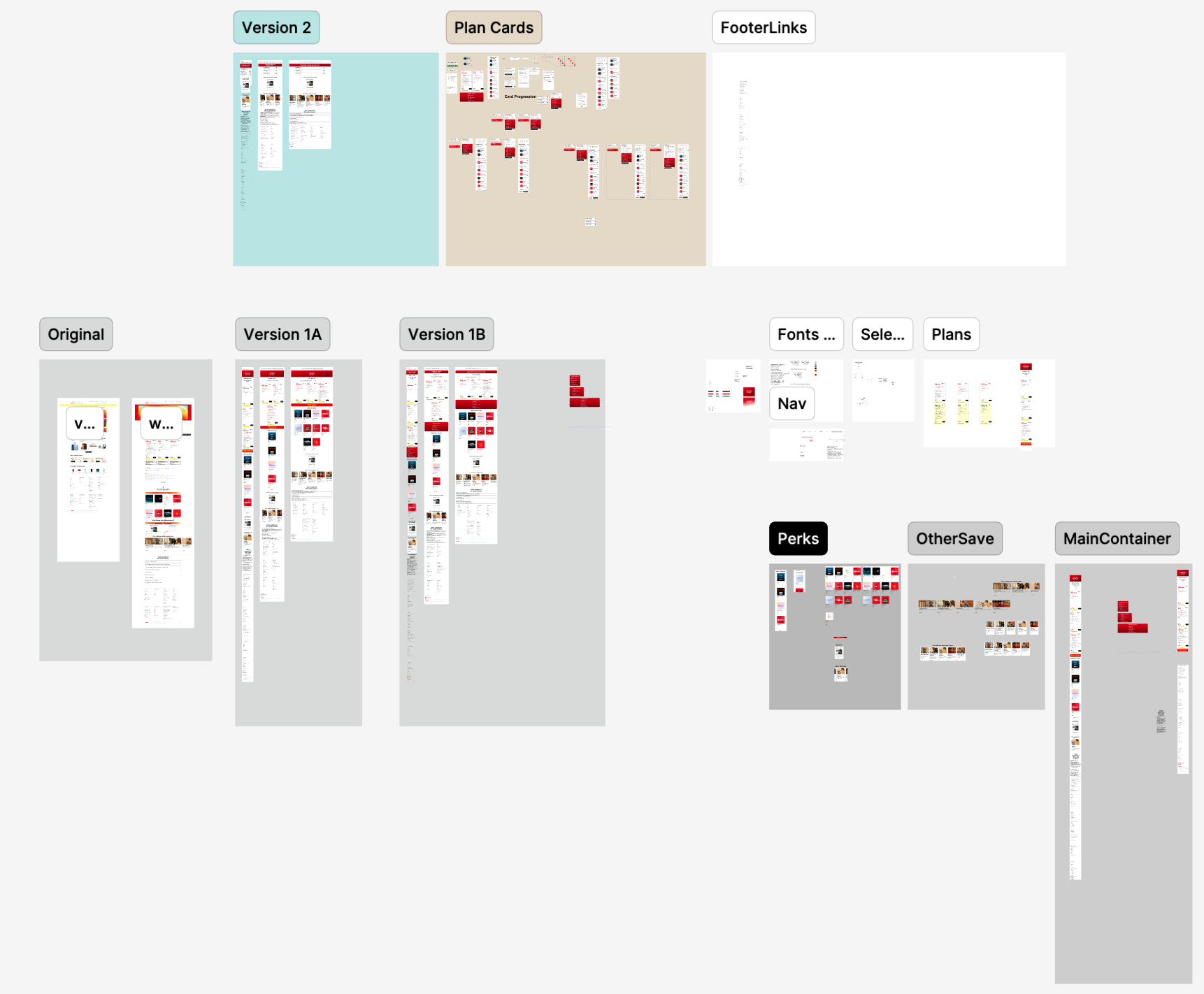
In keeping with the principles that I wanted to apply (transparent as possible, user-centric, and trustworthy) I also performed a content audit, then revised content to simplify or empower as appropriate. I was modest in my changes, and there are more opportunities if Verizon wanted to be more assertive in its approach.
An online version of the Content Design Document can be seen through this link (link).
Trust in…
Of all the user complaints with the telecoms, trust is the largest. Am I getting a good deal, are the companies upselling or creating limited choices to profit over us, or is my data safe? These are questions that are so common among users that they no longer need to even say them out loud. What if the content policy were to address them?
What would happen if users could ask these questions directly, or see what they doubt on informational pages? What if LLMs were used to let users get (guided) answers? What if the impression of Verizon were one of an honest, transparent business that put its users first? I would imagine that it would translate to higher adoption, and I think the first step towards that would be a content redesign. It’s out of scope for the project, but something to think about.
Version 1: Minimal Change
Minimal Change
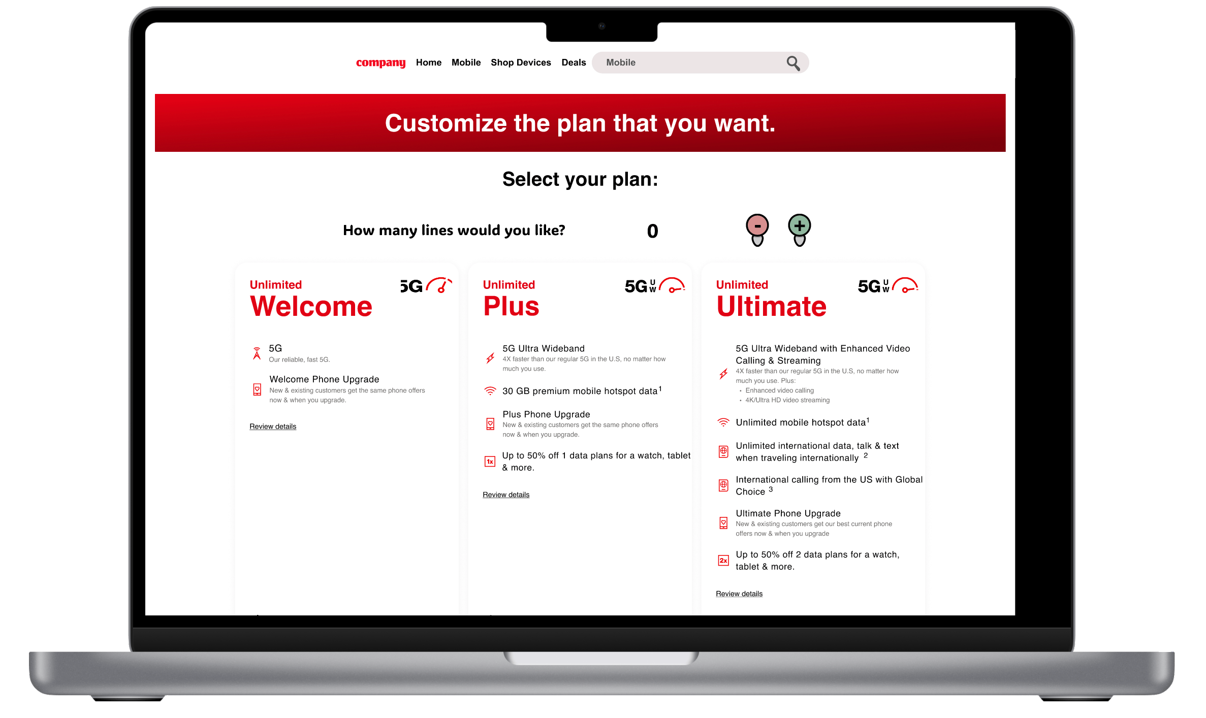
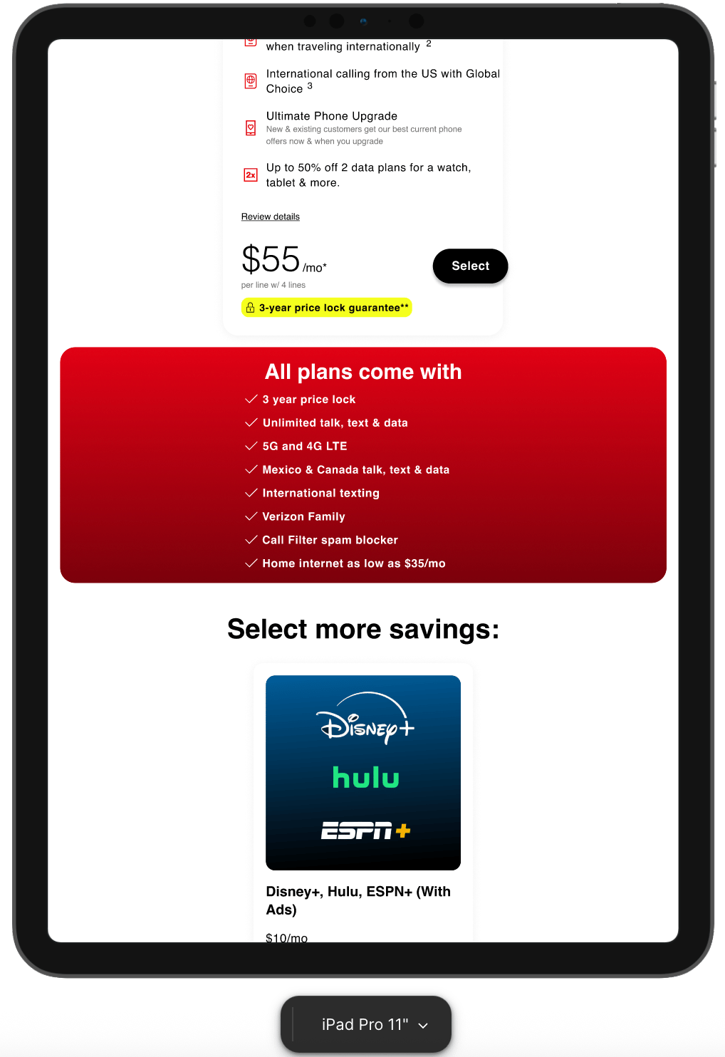
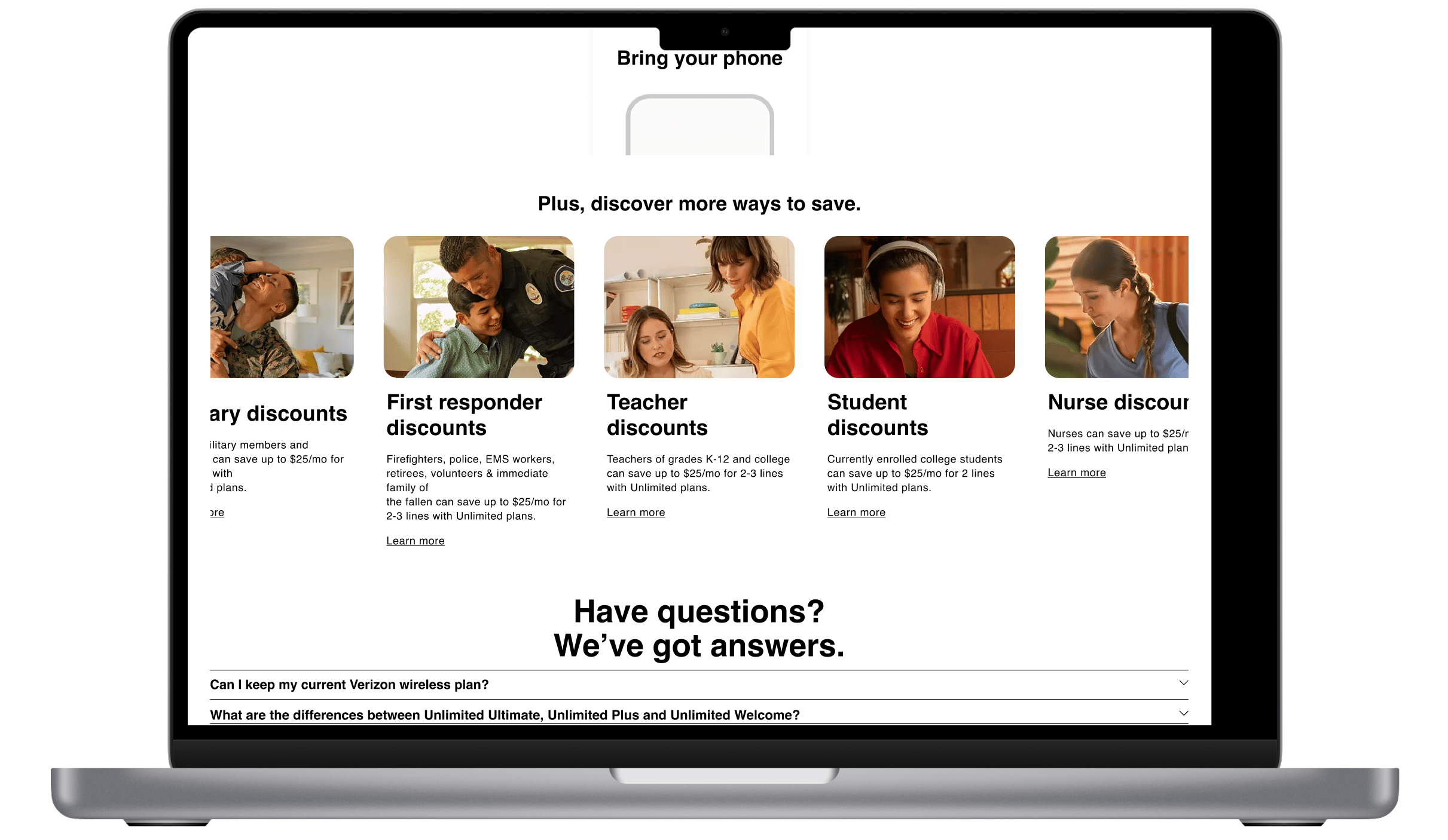
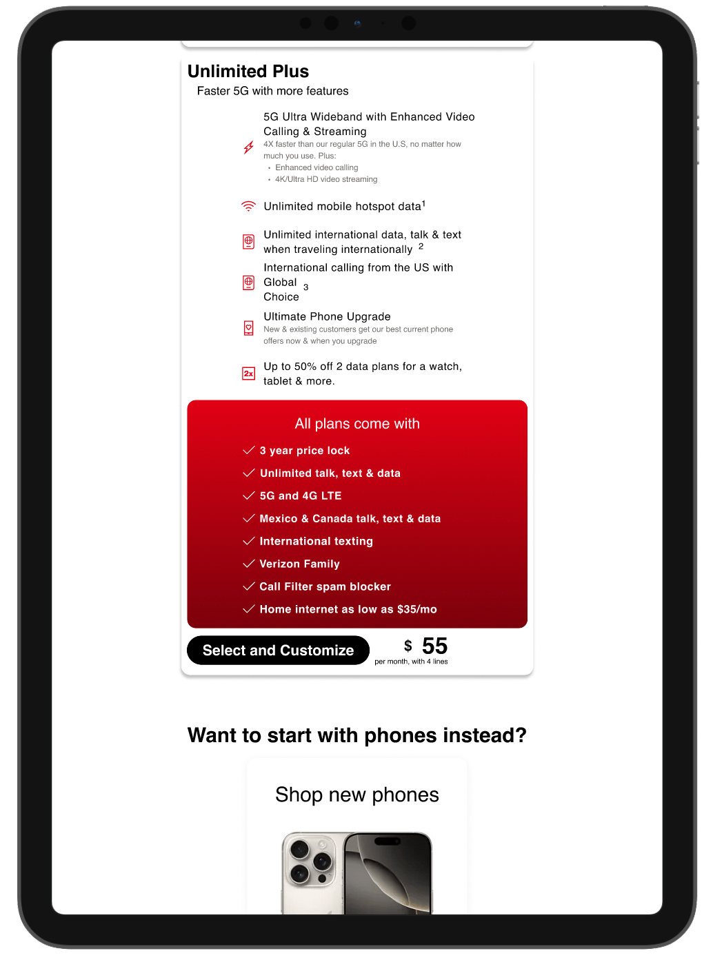
In Version 1 the overall structure and layout were maintained while changes were made to color, content, and some shapes. Some of the changes made in this included:
Minimizing Content
Reduction of hero size, color matching to Verizon logo (original here had a color shift from yellow to red)
Writing streamlined (original hero included 4 lines of text, reduced to “Customize the plan you want”) [A]
Eliminating buttons and badges (original had 4 inactive in the hero) [B, C]
Greater Accessibility
Contrast ratios increased for better visibility
Color simplification (yellow colors reduced to allow for greater daylight viewing)
Images made more clear, larger (in “Perks” and discount sections (Nurses, Police, etc.))
Clarity
Top frame (the vital first view area) now has important information leading to CTAs and choices
Universal plan benefits combined into a single section, with higher contrast and brand color matching
Overall site flow maintained
Version 2: Streamlined Change
Streamlined Change
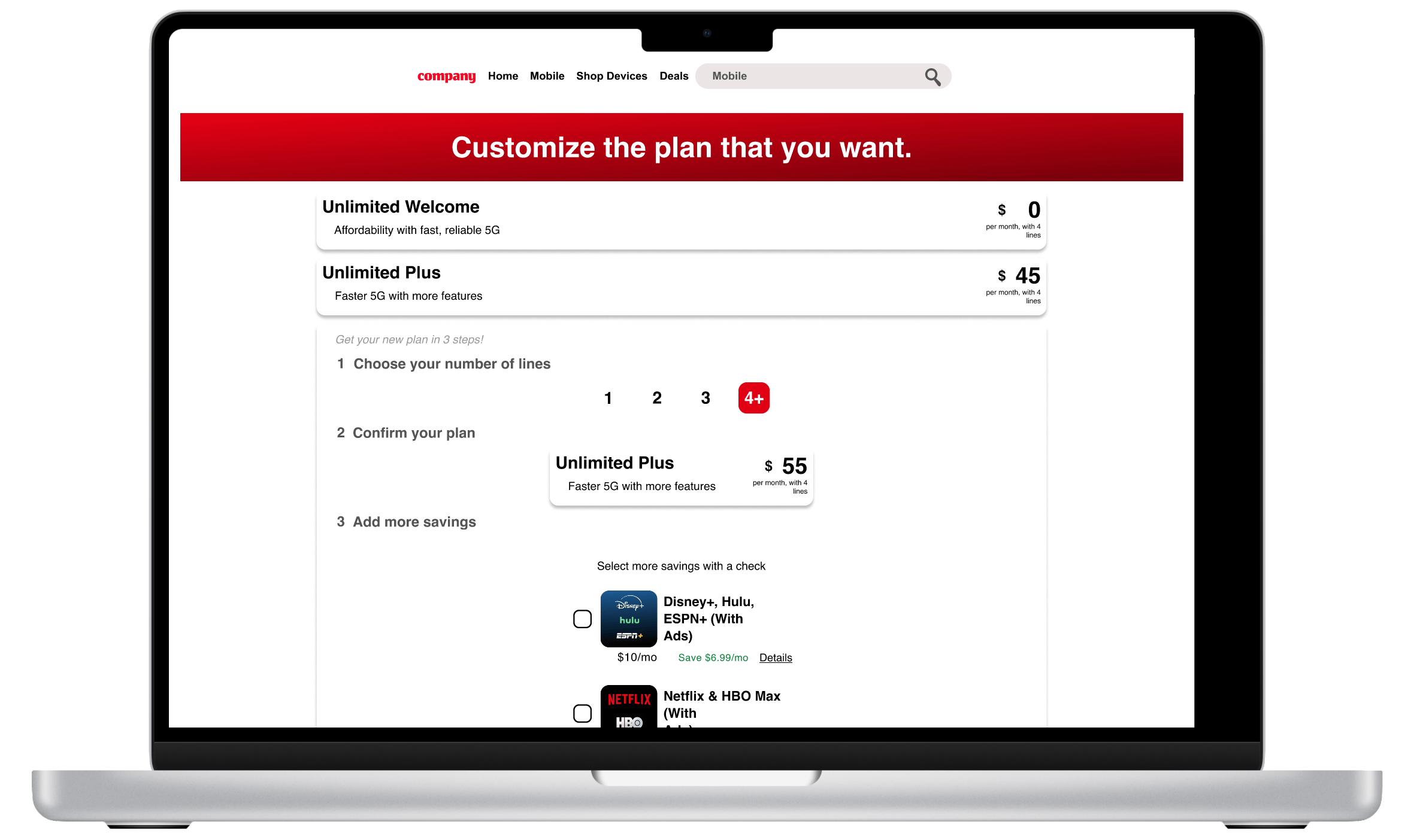
In Version 2 the flow is maintained and the plan selection process is streamlined. Original card layouts are modified to include previously separate functions, and collapsable cards allow for the greatest visibility for plan selection. Some of the changes made in this included:
Plan Card Redesign
Cards are redesigned to expand when users are interested, yet stay at the minimum size otherwise. This allows users to focus more, reducing visual and cognitive load.
“Perks,” otherwise known as Add Ons, have been included into the plan menu, letting users purchase while selecting plans. This has the effect of putting the choices in the checkout process, and making them more suggestive.
New card format brings primary CTAs and choices to top frame (first visual).
Minimizing Content and Streamlining Flow
As with version 1, the hero is greatly reduced and color matched
Writing streamlined and new explanations were written for each fo the plan summaries
Buttons and badges taken away except for plan selector and discount links
Greater Accessibility
Line selector buttons made simpler with button style
Contrast ratios increased for better visibility
Color simplification (yellow colors reduced to allow for greater daylight viewing)
Linear flow introduced during selection process to reduce clutter
Clarity and Transparency
Top frame (the vital first view area) now has important information leading to CTAs and choices
Universal plan benefits combined into a single section, with higher contrast and brand color matching
Overall site flow maintained
Overall version 2 reduces complexity in the selection process, reducing the number of steps and distractions. Formed like a bill from a restaurant, critical screen space is given to selection and CTAs, with add ons, and discounts following. A total at the end tells users what to expect, and clicking through would lead to a checkout page to confirm choices.
Version 3: Yeah, not so much
Generation with AI
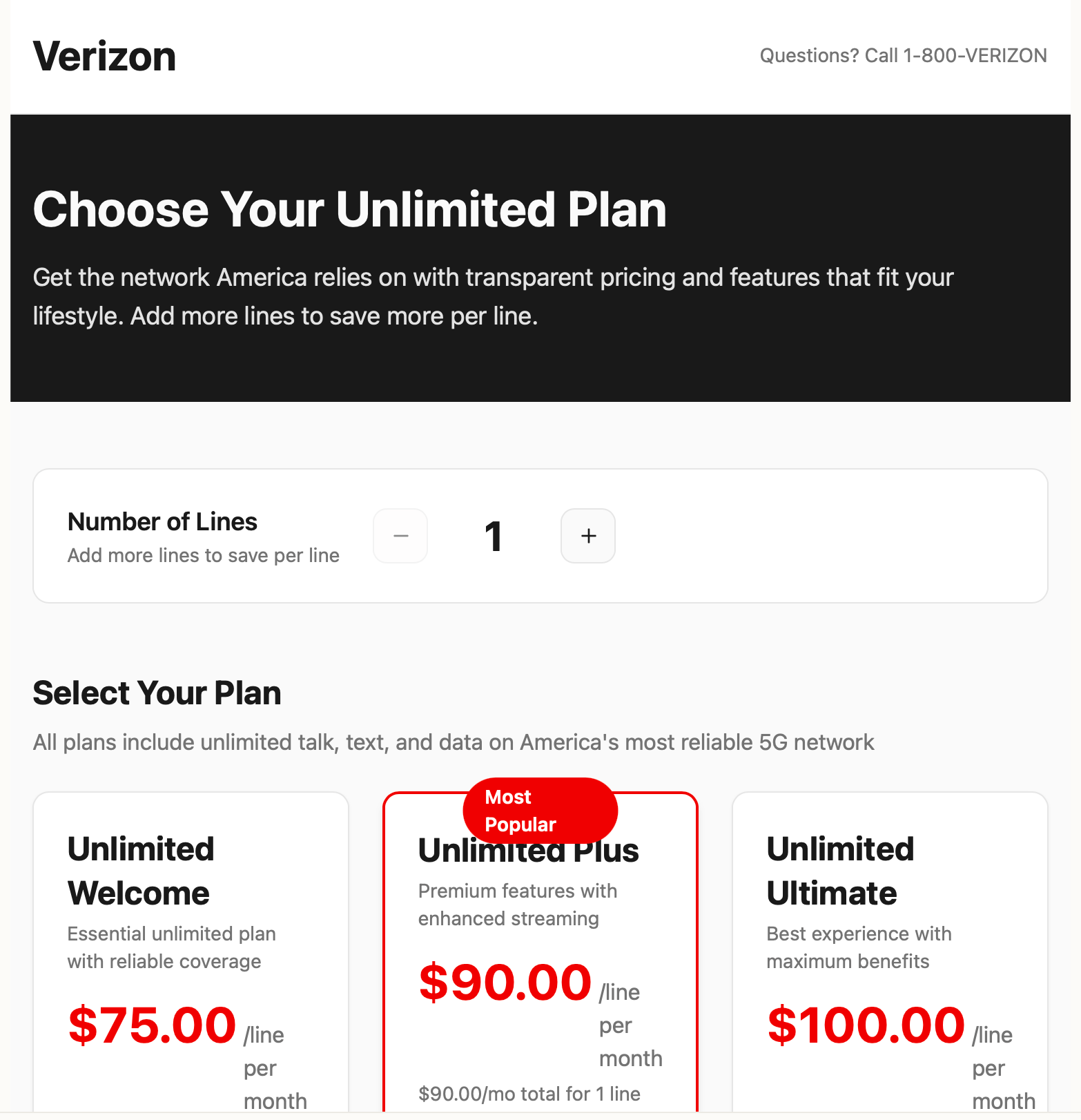
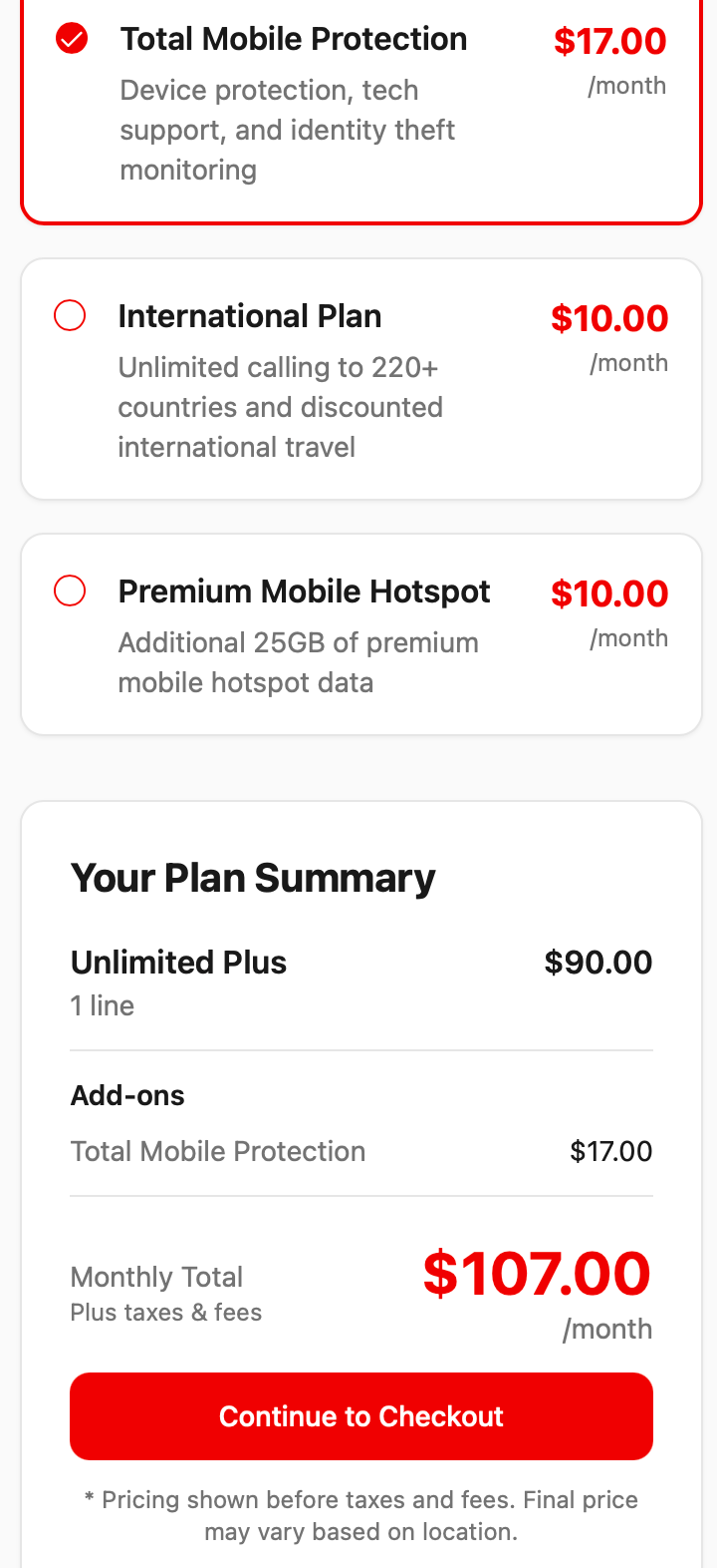
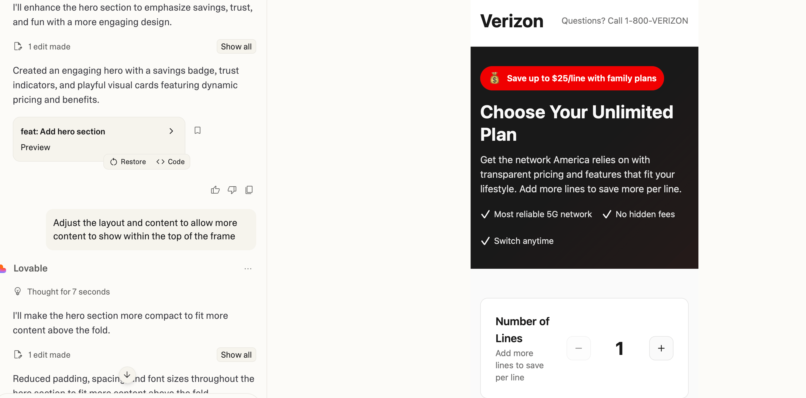
To get a new take on the page, I also prompted the tool Lovable.dev to iterate on how it might approach the challenge. Given the constraints (transparency, user-centric, and trustworthy), as well as existing design, it generated a version that validated many of the choices I made in Version 2. Some of the changes included:
Structure
Space was increased between elements
Information mirrored existing site
Cards and areas are set apart with a gray drop shadow
Buttons and badges taken away except for plan selector and discount links
Color Changes
The hero was changed to black with white text, and most text was set to black. High contrast and with just a few red marks, the effect of the change was to lead the user to the red on the page (bullet points and pricing)
Plan Cards
Cards stayed mostly the same, with the change that prices were placed under the plan title and caption, in red and larger print
Overall version 3 was the least attractive option, with few surprises and a heavy reliance on the existing site. Of course a change in prompt and focus could give some different results, but in keeping with the constraints, Lovable mostly focused on color and spacing. The end result was that contrast was boosted to a stark level, and spacing meant that CTAs and decision areas were pushed off screen.
Testing and Final Results
Testing
Versions were tested with a small sample of users that were open to changing mobile plans. Conducted in live sessions, the users were 60% in favor of version 2, citing the speed and simplicity of the interactions as their preference. The remaining 40% was split between the Lovable version (it’s focus on price), and the existing site (designs made no difference, since they ignored the background, they claimed).
Final Results and Learning
As the project concluded there were several takeaways, the most significant of which was that, even with a small sample, users prefer simplified and clear pathways to their choices. Streamlined choice cards, as in Version 2 are just one way to get there. Checkout processes that allow users more information, clearly and evenly marked (as opposed to greyed or small print paragraphs) raise levels of trust, and are likely to be positively received.
Another takeaway seen in the pain points and user feedback, is how important it is to claim that first-view space. With limited time and attention, time spent scrolling past color-intensive elements can result in diminished attention, losing the first glance memory that will help potential customers retain desired options. Some attention is needed on sizing as well, as was the case of add on icons (Hulu, Disney, Netflix, and the like), to make it appealing and easy for users to understand.
Through the project there were times when I was required to learn about the specifics of telecom offerings, and that was especially true of the fine print that haunts the bottom of these pages. To cover legal risks there are paragraphs of text, much of which may be necessary. From a content perspective it would be interesting to work with the legal department on how to reduce it; there is no question that no user feels comfortable when reading so many conditions to claims made by the company.
Next Steps
Were the project to be continued with an expanded scope, the first step would be testing, as well as establishing requirements from stakeholders. Brand identity, existing design systems, and legal requirements would need to be worked into the new goal, before more extensive testing with users. Some elements that I would advocate for testing would include color, user requirements, and A/B testing for card layouts.
Role: Product Designer
Timeline: 7 days
Leave a Reply