
Business Case
At the start of the project there were already more than ten well known companies working on humanoid robots, doing everything from crafting their own hardware to testing the software that would be running them. For each of them they would need to cross uncanny valleys, test them endlessly, and most pertinent to me, develop interfaces.
As machines that would function aside people, they need an organized user experience, with the ability to operate, schedule, and manage the device, all with command redundancies worked in.
The Problem
Devices as complex as autonomous robots need a way to input commands, perform planning, device management, and have oversight over the device.
Challenges
– Users need rapid, intuitive interfaces to effect change and monitoring
– Interfaces need to work with multiple inputs, with overlapping feedback
– Devices will be new and interactive parts of ecosystems, requiring a large feature sets
OKRs
This project would have objectives for me as well as the company that I imagined the work was for. Project OKRs were:
O Develop a prototype for an human-robotic interface (HRI) that will allow the control, management, and real time management of the device.
KR 1 Determine project type and scope of HRI to best compliment product offerings
KR 2 Deliver a prototype that encapsulates key functions (MVP) of the HRI.
KR 3 Adapt common application elements to facilitate rapid use and understanding of the HRI
Personal OKRs:
O Develop an understanding of user experience design as applied to robotics so that I can build my skills
KR 1 Create a case study for a humanoid robot currently in development
KR 2 Familiarize myself with robotics and the challenges of UX and robotics
KR 3 Apply to robotics companies
KR 4 Use retrospective and lessons learned to identify areas for improvement
To run this project I used a UX methodology fed with online research and informal interviews. The process would follow common design cycles, abbreviated to allow for faster iteration.
As I began this project I jumped at the prospect of making some controller, then quickly realized my biggest assumption — that a robot needed one at all. With my first dive into research it became clear that controls were internalized within robots, and there is a strong drive toward autonomy. So a revised information flow looked like this:
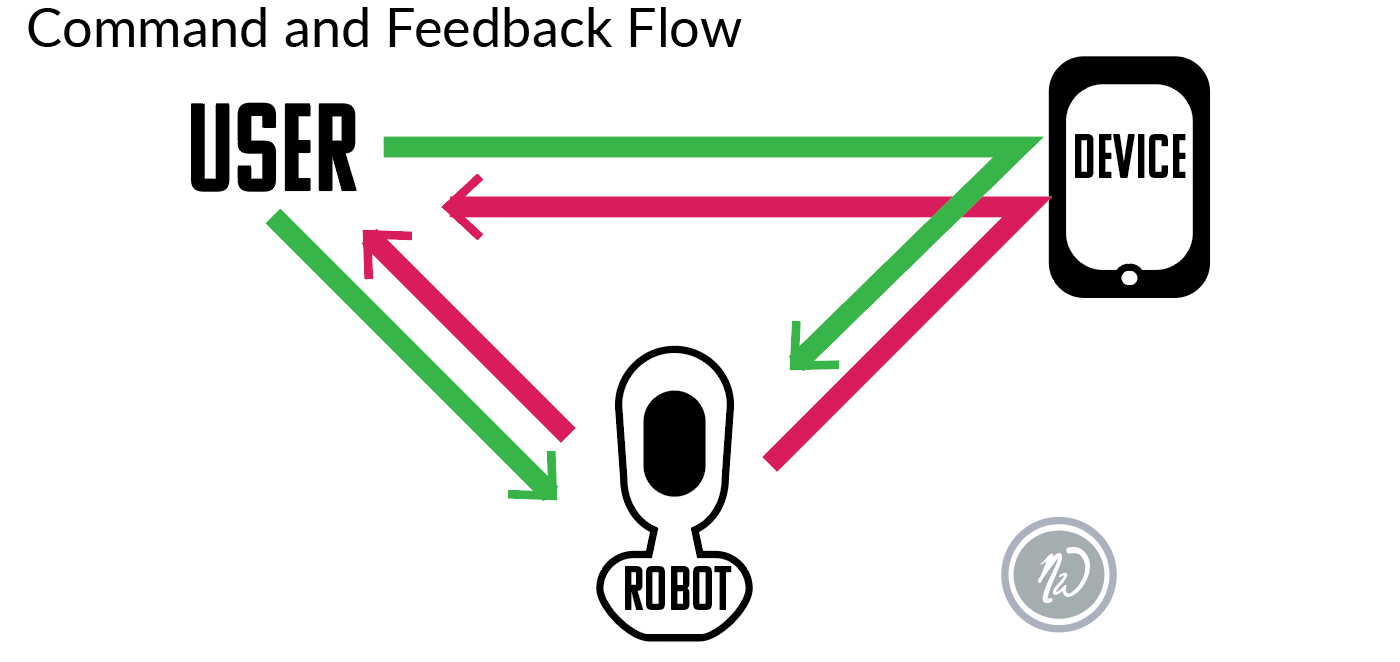
A companion to the robot, I reasoned, would be better, and allow oversight. A good start, but I would need more
Research
Before reaching out to people around me, I began reading. From releases from the robotics companies themselves to research and white papers I began to understand the tremendous capabilities of the robots, which are limited mostly by their hardware. New forms of interactions such as projectable interfaces, direct haptic input like typing on the robot itself, and gestures open up whole new areas for UI /UX, as well.
With a handle on the product I reached out to people around me. Friends, family, software and electrical engineers, as well as people with a variety of backgrounds were discretely polled for opinions and desires when it came to the future tech. They came back with a lot of good information, and a few common assumptions.
Common assumption 1: Tell the thing what to do. It does it.
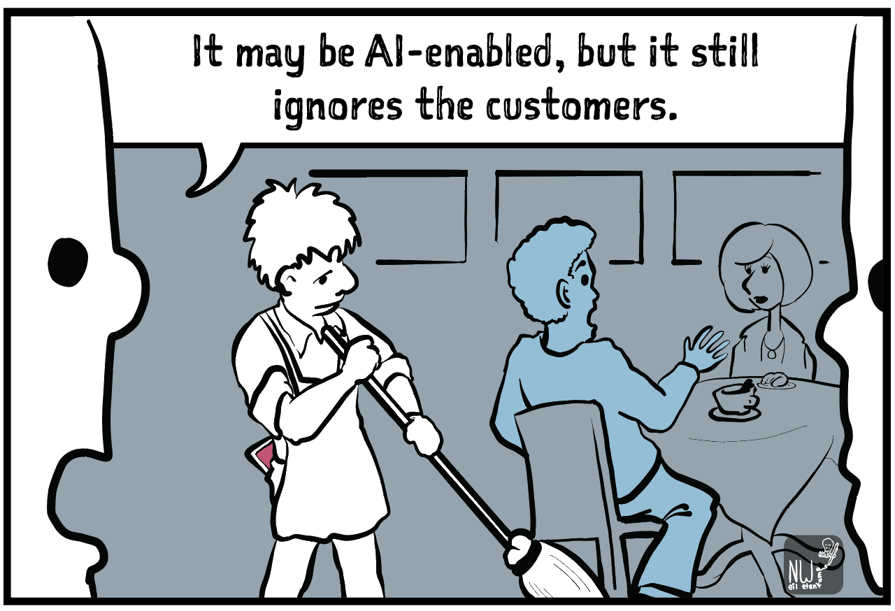
Anyone that’s hired an employee knows that this doesn’t always work well. People — and here we can lump in robots — have their own interpretations and may not see the task the way that you do.
Managers and organizations spend a lot of time clarifying tasks, making sure everyone is motivated for it, and even incentivizing their completion. While motivation isn’t an issue for our mechanical friends, clarification certainly will be.
Anyone that’s hired an employee knows that this doesn’t always work well. People — and here we can lump in robots — have their own interpretations and may not see the task the way that you do.
Managers and organizations spend a lot of time clarifying tasks, making sure everyone is motivated for it, and even incentivizing their completion. While motivation isn’t an issue for our mechanical friends, clarification certainly will be.
Common assumption 2: One robot fits all.
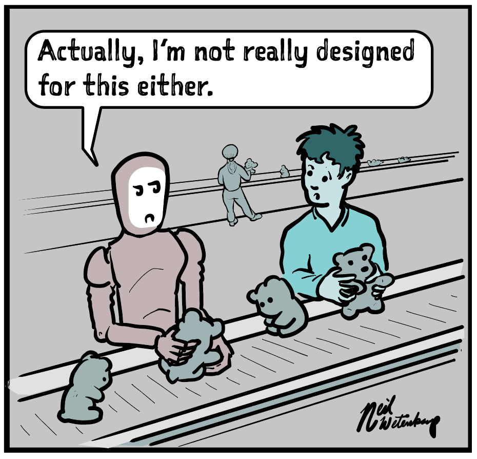
Modeled after the versatility of our own bodies and minds, robots will undoubtedly be able to do a wide range of tasks. As we have seen in the automotive sector, however, humanoid robots are not always the solution needed for the problem at hand.
In this project I used a task profile that followed general use (rather than specific job task profiles), with the idea that the robot would be used in home and office settings.
Common assumption 3: The robot gets me.
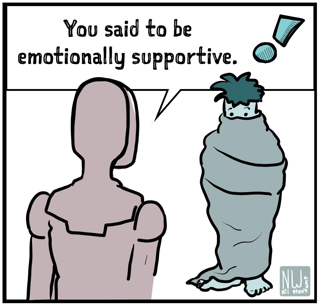
If we think about our own interactions with fellow humans it won’t take long to stumble on a memory of a miscommunication. Our lives (and sitcoms) are full of them, so any interface will need to help both parties understand each other.
With the three main assumptions to challenge, I began to identify more specific working points.
Tell the thing what to do. It does it.
That would be ideal, yet we know that noise in communication (environment, language, understanding, etc.) can result in miscommunication between humans, and it is unlikely that robots would do any better. Directions could easily be misunderstood.
Solution: A companion device that could be a comprehensive task input source, allowing users to see what the robot sees as its task. A redundant input that would let users verify tasks, schedule, and visualize tasks, reducing possible confusion.
One robot fits all.
While universal interfaces are impressive, I had to acknowledge that a more specialized interface may be necessary for environments with specialized task sets. A nuclear reactor, despite what some babysitters say, is a very different task set, with the need for several layers of redundancies.
Solution: Look upward, toward project leadership and corporate guidance on user segments and markets. Separate UI/UX may be required. For this project, I decided to aim for a general purpose interface for a robot that was equally broad in use.
The robot gets me.
Yeah, not so much. While LLMs and AI can act as predictors for human responses, there is still a long way to go. As such, a pragmatic interface can help humans (users) understand the limitations of the robot as well as see how their requests are interpreted.
Solution: Simplified design, task trees, redundant inputs, simultaneous feedback, and monitoring abilities can allow users to use the robot with confidence and with realistic expectations.
Revised goal:
Develop prototype designs for a Human Robot Interface that allows users to input tasks, verify, monitor, and operate a robot so that users can free up their time or resources.
A shiny new goal in mind, I gathered more information and began to process it, using what I gathered from interviews and journey maps to formulate personas and refine my thoughts.
Since most of the actual users of robots are in labs, secreted behind NDAs and fences, I would use the ideation phase to develop a better sense of the project’s needs.
Design and Discovery (Ideate)
When the time came for ideation, I tried to free up my preconceptions through How Might We, Crazy 5s (8 is like, so much time, right?), and some fun visualizations.
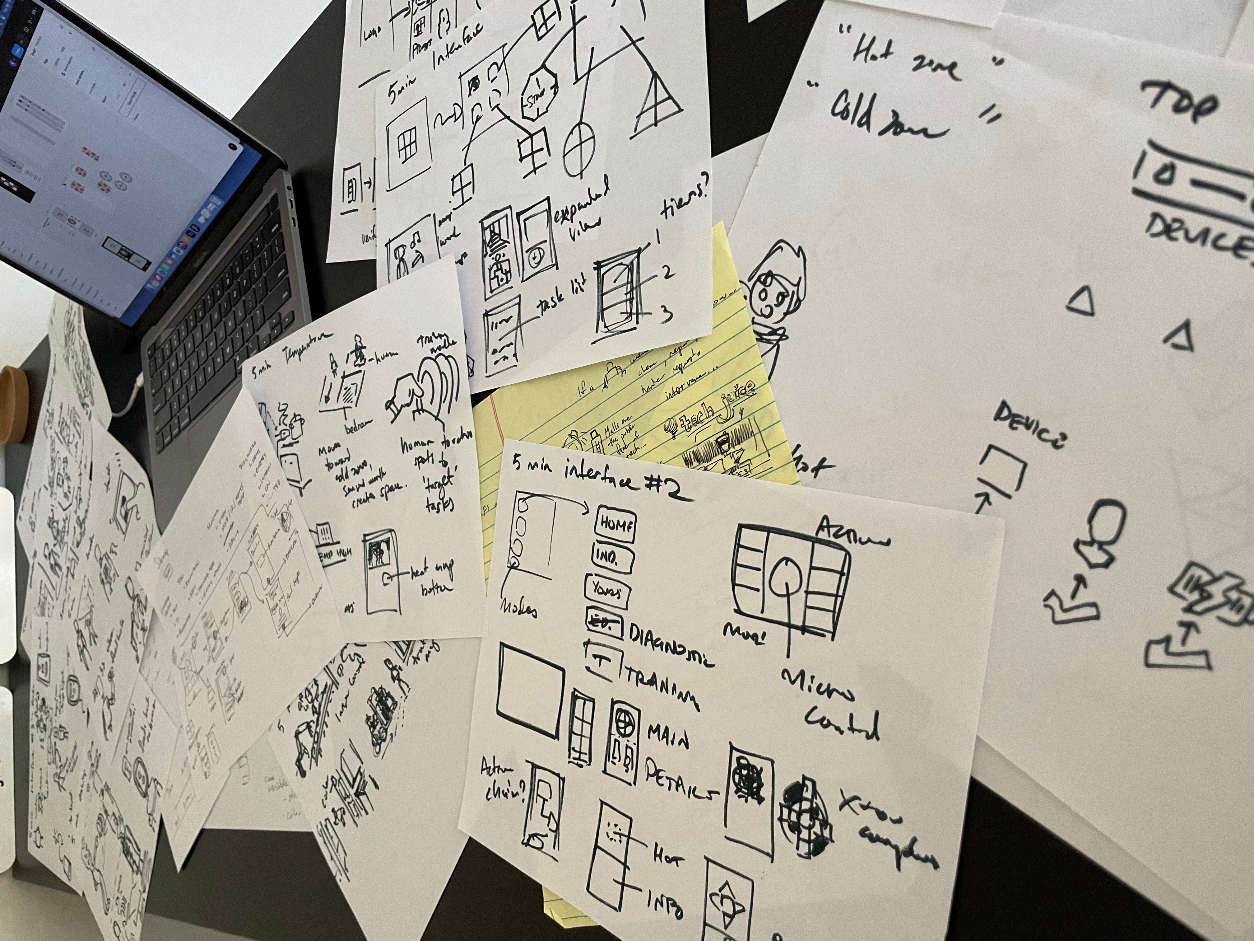
A whole lot of paper and some marker on my face later, designs were taking shape. I already had ways to deal with some of the user pain points, and had some unique insights into how new interaction methods with the robot could be capitalized on.
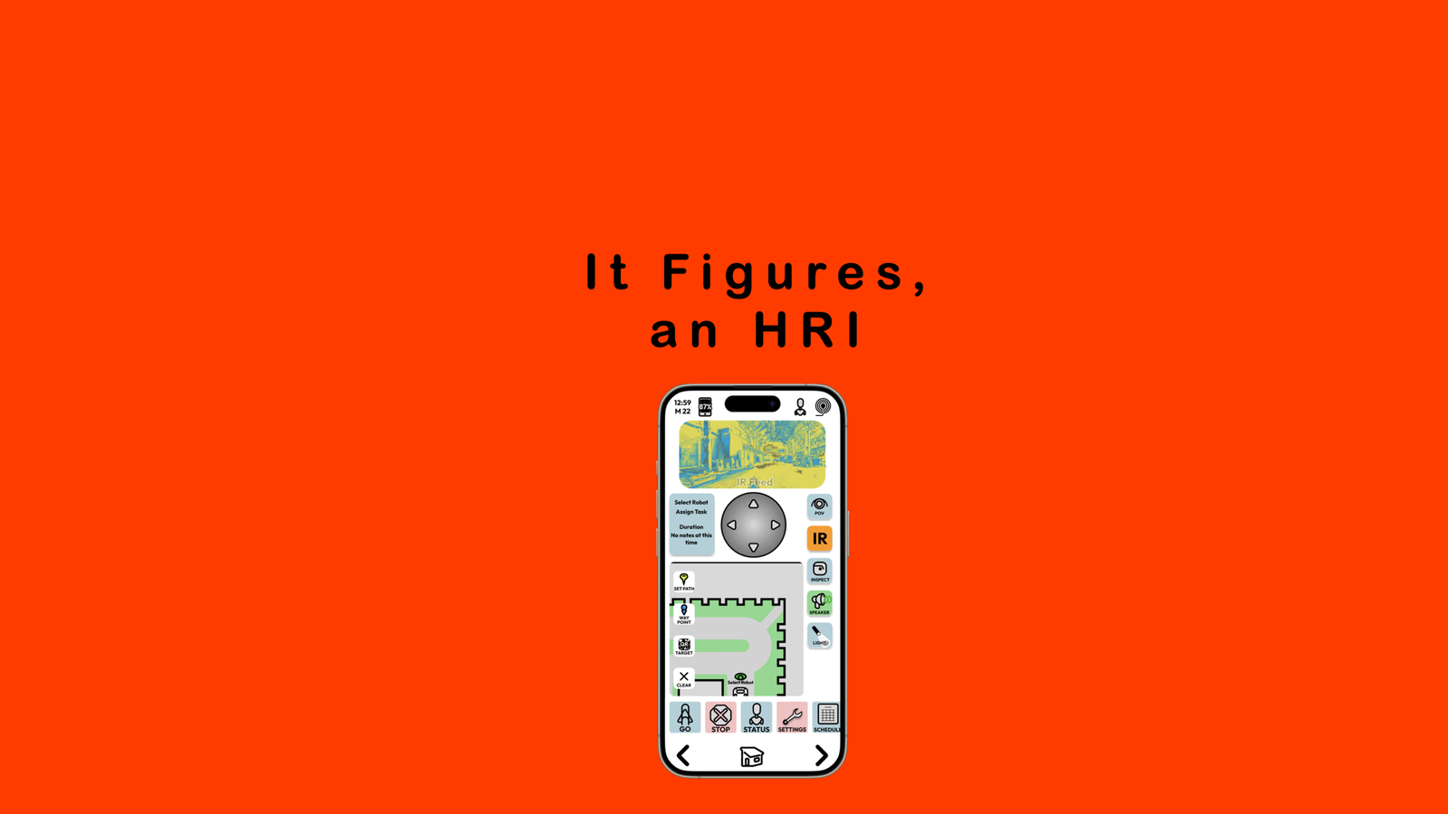
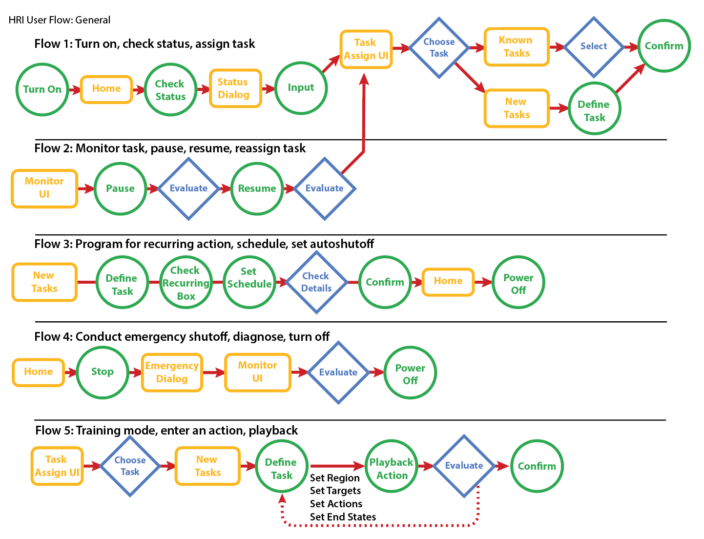
The user flows were helpful maps for wireframing, and it was in that phase that the next problem came up. Users were going to need an intuitive and consistent element to control the robot throughout the flow, and the flows should be as linear as possible. The design was for a companion device, after all, and not to replace the robot.
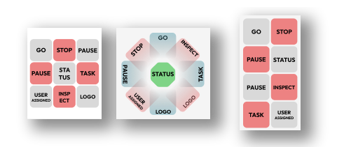
The solution for what I would later dub the ‘command key’ would come through more pen and paper (what can I say? I love me some analog!), and I came up with a few versions of an element that could control the primary functions of the robot, including an emergency stop. I fed it into to Figma to see how it would look, and went from there.
Design Notes
Often when designing or drawing, I like to work with a theme. Sometimes its circles, animals, or other unifying feature that helps bring things together. For this project I imagined my client was a well known robotic company, and took my design cues from there. Adopting the grid and square and grid that they embrace allowed me to work within design constraints, as well as helping with the visualization of design. As such, the design of the first command wheel started from squares and evolved from there.
Early Prototypes
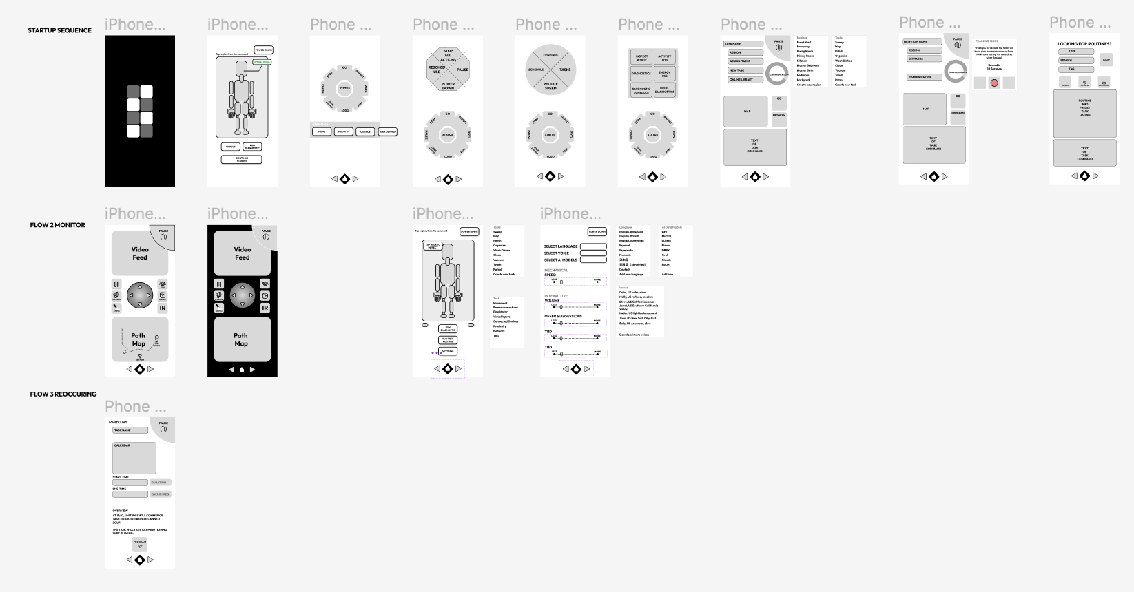
Its hard not to see the wireframing and early prototype period as the same thing for me. It’s like those early moments of a sculpture, where you just can’t stop. The frame is just there, empty and you want to add more meat to it until you at least know what it should be.
For this project the wireframes showed how some pages would need more attention, and it wasn’t long before new prototypes were needed.
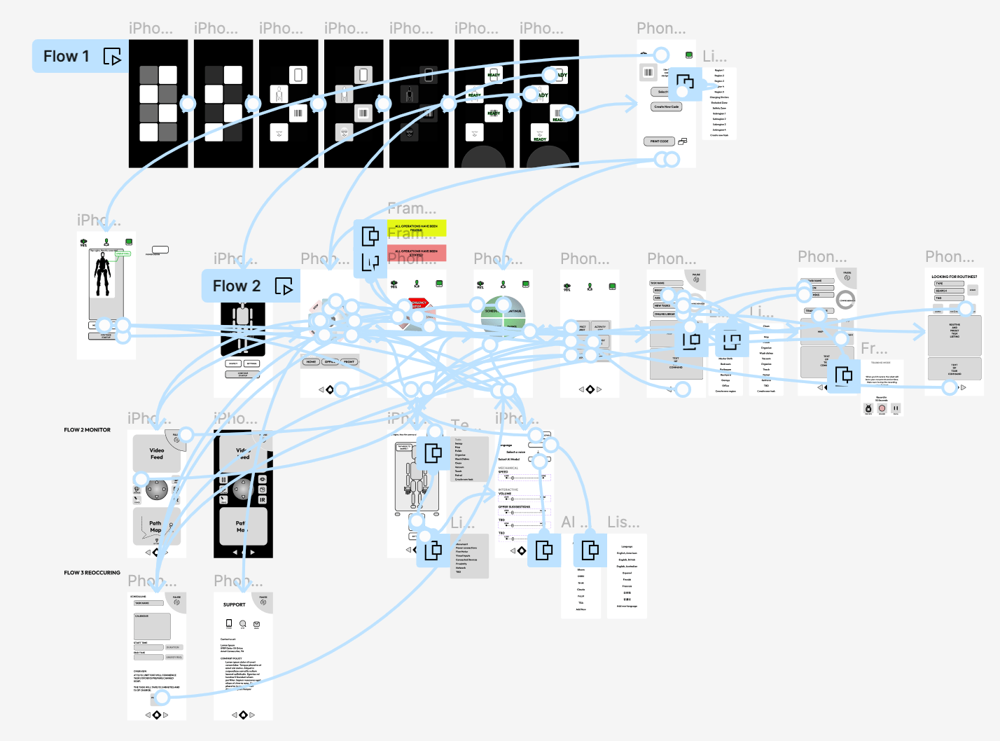
Problems with Prototype 3
On the third prototype there were issues that came up. Testers liked the flow and ease of use, but did not always know the function of elements, and sometimes got lost from their initial purpose.
Sounds like debugging to me, so I got into solving the problem.
The first solution was to enhance the startup process, making it more clear that the robot was like a computer; it needed to be powered, prepared, and instructed. The startup sequence would also temper more impatient users, and at the end of the sequence the diagnostic page would come up, reminding them further to handle the robot responsibly.
Next came streamlining. From navigation to design elements, everything was simplified. Color choices were reduced to nearly a binary level, and overlays were used instead of separate pages. Keep everyone focussed on the primary pages, I thought, and made sure they were always a mere click away.
Important controls such as continuing or pausing were now on every page, and the monitor page became one of the most important pages, with the highest degree of control.
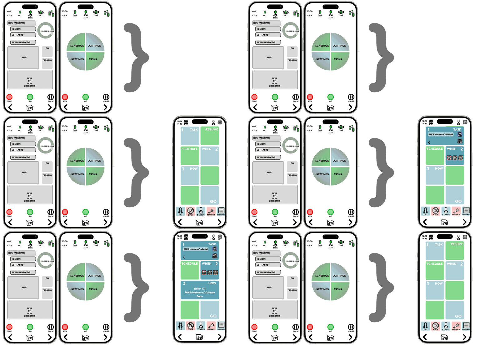
Pages were combined where possible to make more capable and centralized controls.
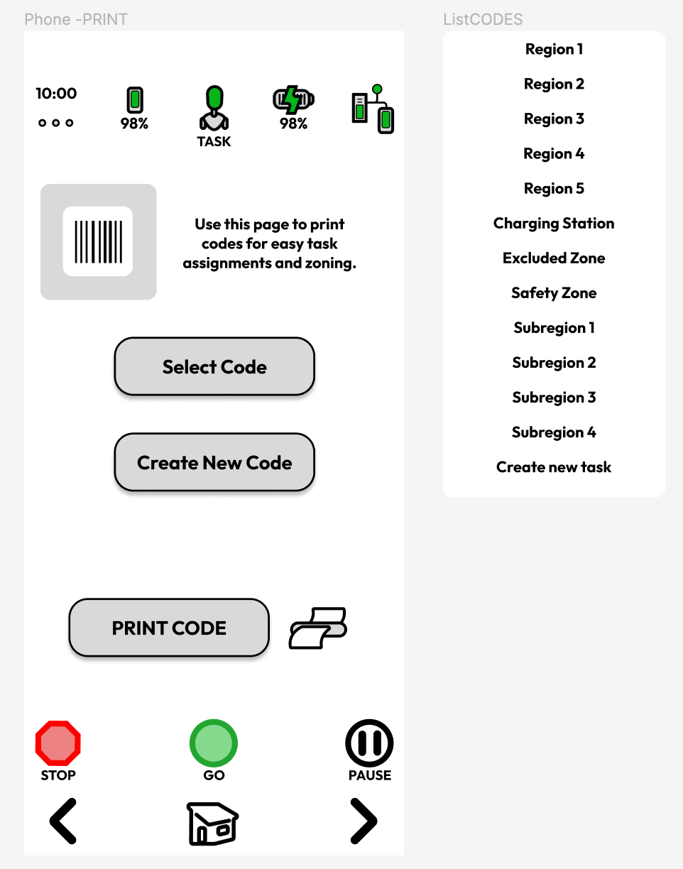
Among the interesting developments in the early iterations was the inclusion of a print page for QR codes (or any code really), that could be used to ‘code’ an area for a specific activity or behavior. In my thinking it would be an additional way to establish routines for workstations or common tasks, saving time for the user with predetermined targets, goals, and behaviors.
Refinements with Prototypes 4
Interestingly, the more I worked the interface, the more I took away. Since robots have several lines of input and feedback, the need for simplicity demanded that some things were streamlined even further.
This was not only an issue with design, as I saw with the command wheel, but also in function. Further simplification was better, I felt, for keeping the operator focussed on the operation, and not spending too much time with the interface. Unlike interfaces for specific devices, this UI needed to walk the balance between high functionality, accountability, and practical pleasures.
Entire pages like this one were taken out from the user flows and their functions split into to existing pages, making the UI more capable and easier to operate.
The Project in Motion
As the project reached a point where it would need a serious usability study (and dare I say underwriting) to test its function with an actual robot, it was time to put it in the portfolio. I had learned a lot, refined my abilities, and the project had changed how I thought about design and function. It was a very rewarding process.
OKRs, Again
KR 1 Determine project type and scope of HRI to best compliment product offerings
Though there was a some shifting as I challenged assumptions about the project, the type and scope of the HRi stayed the same. Existing models of humanoid robots had interfaces already worked into their bodies, yet a separate controller (HRI) would be essential. Running after a robot while on its task is impractical, and everyday devices (phones, tablets, etc.) as companion controllers would remain a stable and easily accessible redundancy.
Special considerations for spatial awareness, separate audio/visual inputs, and other sensor enhancements could also be included as the interface was improved upon.
KR 2 Deliver a prototype that encapsulates key functions (MVP) of the HRI.
Done.
The prototype satisfies the requirements that match the minimum viable product profile of an HRI, though it should be said that as robotics continues to improve with each version, the completed prototype is likely to be outdated. I would maintain that the project holds value as an iteration; considerable time was spent on function and needs, and while technology is likely to outstrip some of the functions of the HRI, a deeper investigation into accommodating users is always welcome.
KR 3 Adapt common application elements to facilitate rapid use and understanding of the HRI
As mentioned before the project type was chosen to take advantage of devices likely to be in use by the users, and in addition to that, many elements were shaped to take on well known roles inside the project. Originality was employed while making things intuitive for users. Usability tests of the project were generally in line with what users expected of a mobile app. Difficulties during the testing process were generally limited to the prototype itself, and not about the iconography or flow.
What’s Next
Contact me at neil.inker @ gmail.com.
Half kidding – the next step for the project would be ask some questions of whoever would adopt it, to make sure the direction made sense. For starters, does it make sense to integrate an interface into existing devices?
Users definitely like to use one device instead of several, however there are some tradeoffs in security and product control. A dedicated interface, for example, could ensure that the robot company’s OS is not affected by external programs, and keep usage data internalized.
Also, what other inputs and outputs are available to the designer?
Are there projectable interfaces, power tethering, temperature zoning, or other methods of input to enhance functions and the user experience?
What do actual users think?
A test of users of actual robotic systems, would be another important next step. Truly take stock in its function and capability. If it were to be useful, then it could be adapted to integrate with the robot’s display, other devices, and tested in actual use.
As I mentioned, this project was fun. It called for all the discovery, imagination, and problem solving that makes UX work so attractive. If you have questions, thoughts, or comments I would love to hear them. This was a thrilling project and I hope to do more in robotics and design. Feel free to contact me at neil.inker@gmail.com with feedback, questions, or offers.
Leave a Reply